WatchOS 27 Simplifies Apple Watch Interface, Prioritizing Frequent Use
Introduction
The latest iteration of Apple's wearable operating system, WatchOS 27, has arrived, and with it comes a subtle yet profoundly impactful change to the user interface. While major software updates often bring a flurry of new features, the true genius of WatchOS 27 lies in its deliberate simplification. The introduction of a dynamic app grid is poised to solve a long-standing issue for many Apple Watch users: the overwhelming clutter of applications on a small screen. This update prioritizes ease of use and efficiency, a testament to the principle that effective design often comes through subtraction rather than addition.
Key Details
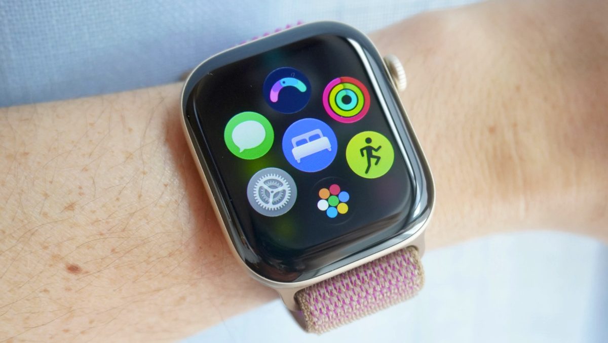
- Dynamic App Grid: WatchOS 27 replaces the traditional static app grid with a dynamic view that prioritizes frequently used and recently accessed applications.
- Streamlined Home Screen: Users now see a curated selection of their top six apps upon pressing the digital crown, with access to the full app library just one additional tap away.
- Reduced Clutter: This new approach significantly declutters the home screen, making it easier to find and launch desired applications.
- Enhanced Precision: The simplified interface is particularly beneficial for users with larger fingers, reducing the need for precise tapping on small app icons.
- Compatibility: WatchOS 27 is available for Apple Watch Series 9, 10, 11, and 12, Apple Watch SE 3, and Apple Watch Ultra 2, 3, and 4, requiring an iPhone update to iOS 27.
- Other Features: The update also includes a more agentic and conversational Siri with its own app, and a new gesture to open the Smart Stack for quick access to widgets like step tracking and song identification.
Background
For years, the Apple Watch home screen has presented users with a dense grid of application icons. While offering access to a vast array of functionalities, this approach often led to a feeling of being overwhelmed. With dozens of apps vying for space on a screen the size of a postage stamp, selecting the correct application could be a frustrating experience, especially for those with less dexterity. The previous interface demanded a high degree of precision, often requiring multiple attempts to tap the intended icon. This design, while comprehensive, did not always align with the core promise of a smartwatch: quick, convenient access to essential information and functions.
Impact Analysis
The dynamic app grid in WatchOS 27 directly addresses the usability challenges posed by the previous interface. By intelligently surfacing the apps users are most likely to need, the update dramatically reduces the cognitive load associated with navigating the watch. Instead of scanning through a lengthy list or grid, users are presented with their most relevant tools immediately. This not only saves time but also enhances the overall user experience, making the Apple Watch feel more intuitive and responsive. The simplification means fewer taps, less scrolling, and a more focused interaction, transforming the device from a potential source of minor frustration into a seamless extension of the user's digital life.
The greatest software updates, in my opinion, don’t fundamentally reinvent a product. They simplify it. The dynamic app view on WatchOS 27 does exactly that.
Broader Context
This shift in WatchOS 27 reflects a growing trend in user interface design, particularly within the wearable technology sector. As devices become more powerful and capable, the challenge lies not in adding more features, but in making existing ones easily accessible and manageable. The Apple Watch, with its compact form factor, is a prime candidate for this design philosophy. By embracing subtraction, Apple is not only improving the experience on its own device but also setting a potential benchmark for competitors. The hope is that other smartwatch manufacturers, such as Samsung and Google, will adopt similar approaches to declutter their own interfaces, fostering a more user-friendly ecosystem across the board.
Future Outlook
The success of the dynamic app grid in WatchOS 27 could pave the way for further refinements in wearable UI design. Future updates might explore even more sophisticated personalization algorithms to predict user needs, or perhaps introduce adaptive interfaces that change based on context or time of day. The integration of a more capable Siri also suggests a future where voice commands and AI-driven assistance play an even larger role in navigating smart devices. As the lines between hardware and software continue to blur, the focus on simplifying complex interactions will likely remain a key driver of innovation, ensuring that technology serves to enhance, rather than complicate, our daily lives.
Conclusion
WatchOS 27, through its seemingly minor change of a dynamic app grid, delivers a significant improvement to the Apple Watch user experience. It tackles the persistent issue of interface clutter by prioritizing essential functions and streamlining navigation. This update exemplifies how thoughtful design, focused on simplification and user efficiency, can have a profound impact. By making the most-used apps readily accessible and reducing the need for extensive searching, Apple has enhanced the core utility of the Apple Watch, making it a more intuitive and indispensable tool for its users.
Source: zdnet.com